Salamtak for Doctors: One Calm Desk for Every Clinic
Designing for busy hands: one calm desk for every clinic, visit and patient record.
Company
El-Korashy
Role
Senior Product Designer
Expertise
Product Strategy, IA, UX/UI, UX Writing
Timeline
2022 · 2025

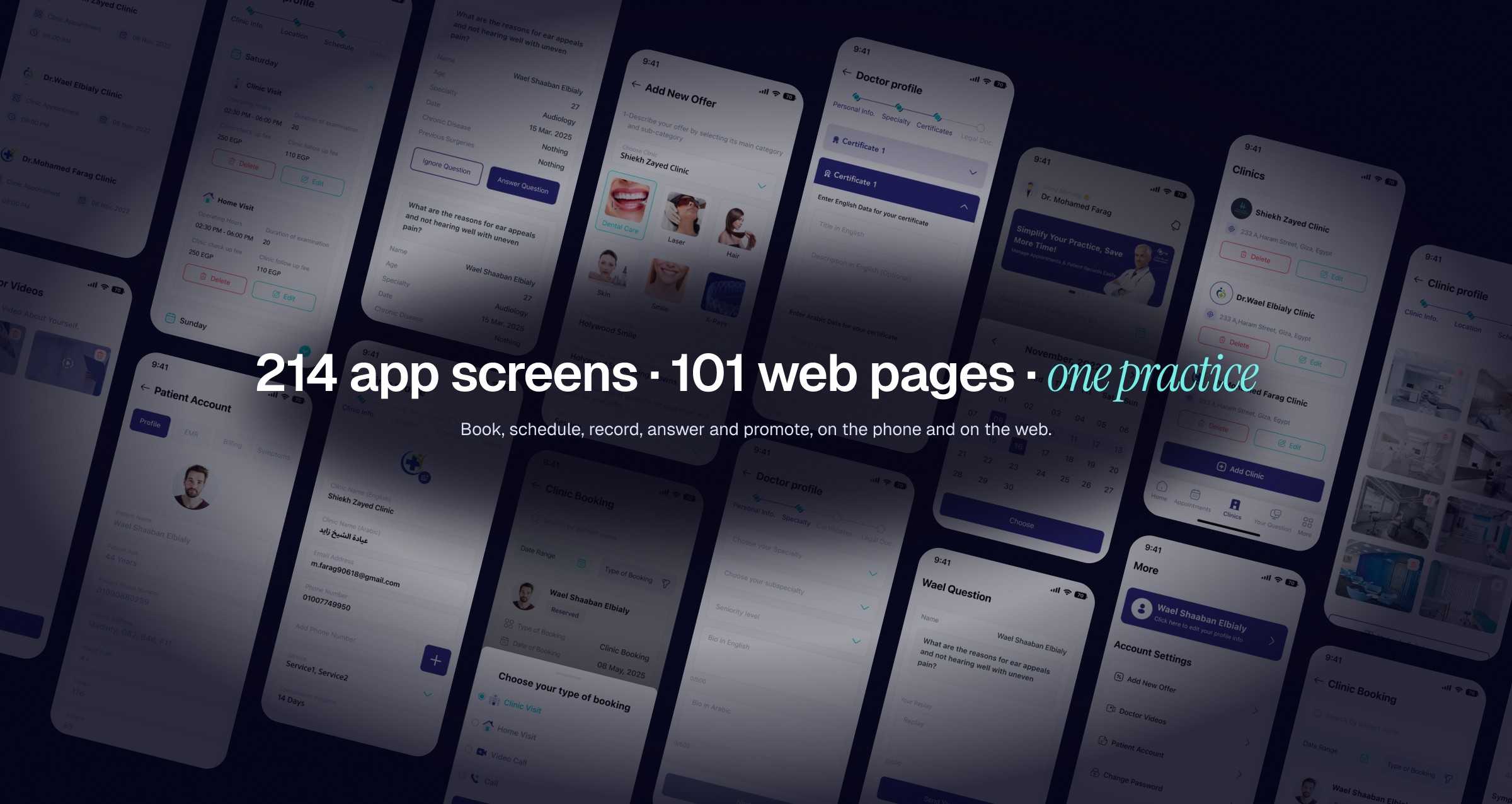
Salamtak for Doctors is the other half of the Salamtak platform: the app and web dashboard that doctors and polyclinics in Egypt use to run their practice. It covers sign-up and verification, several clinics with their own schedules and fees, four kinds of visits, patient records, patient questions and offers. I designed it with one other designer, sharing the whole product equally. We designed the first version in 2022 and a full redesign in 2025.

The Problem: A Practice Split Across Clinics, Phones and Paper
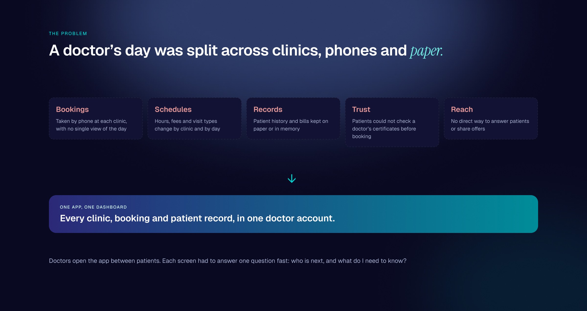
A doctor often works in more than one clinic, and each clinic has its own hours, fees and kinds of visit. Bookings came in by phone at each clinic, with no single view of the day. Patient history and bills sat on paper or in memory. Patients had no easy way to check a doctor’s certificates before booking, and doctors had no direct way to answer questions or share offers. Doctors also open the app between patients, so every screen has a few seconds to answer one question: who is next, and what do I need to know?
The Goal: One Desk for the Whole Practice
Give each doctor one account that holds every clinic, booking and patient record, on the phone and on the web, connected to the same bookings patients make in the Salamtak app.
Decision 01: Show the Whole Day Before the First Patient
The home screen opens on three numbers: today’s cases, handled and un-handled. Below them, bookings are split by visit type (in-clinic, home visit, video call and call), each with a live count and a clinic filter. A date field and calendar move the whole home to another day or period, so planning tomorrow uses the same screen as running today.

Decision 02: Build Trust at Sign-Up
Patients choose a doctor they have never met, so the profile has to be credible. Sign-up is a four-step flow (personal info, specialty, certificates and legal documents) with a progress bar that keeps a long form from feeling endless. Certificates are entered in English and Arabic, with the year and an image, so the profile reads right in both languages. Polyclinics have their own sign-up path, built around the clinic rather than a single doctor.

Decision 03: One Doctor, Many Clinics, Each With Its Own Rules
Each clinic gets its own profile in four steps: info, location, schedule and gallery, plus contracted insurance companies and clinic features. The schedule is organised by day; each day holds periods for clinic and home visits, with operating hours, examination duration, check-up fee and follow-up fee. Every period can be edited or deleted from its own card, so a change in hours does not mean redoing the profile.

Decision 04: The Patient’s Story, One Tap From the Booking
Appointments carry status tags (reserved, cancelled, completed) and can be searched by patient and filtered by date range and type of booking. From any appointment, the doctor opens the patient account: profile, medical record, billing and symptoms in four tabs. After the visit, the doctor adds a record entry with the diagnosis, medication and prescription notes, so the record does not live on paper.

Decision 05: Answer, Teach and Promote in the Same App
Patient questions arrive in their own tab with context (age, specialty, chronic diseases and past surgeries), and the reply is kept focused at up to 500 characters. Offers are built in four steps: clinic and service, number of sessions, price and expiry dates, then photos, with the discounted price worked out from the original price and the discount. Doctors also manage their own videos, and the Salamtak Gate content is one tap from home.

The Website
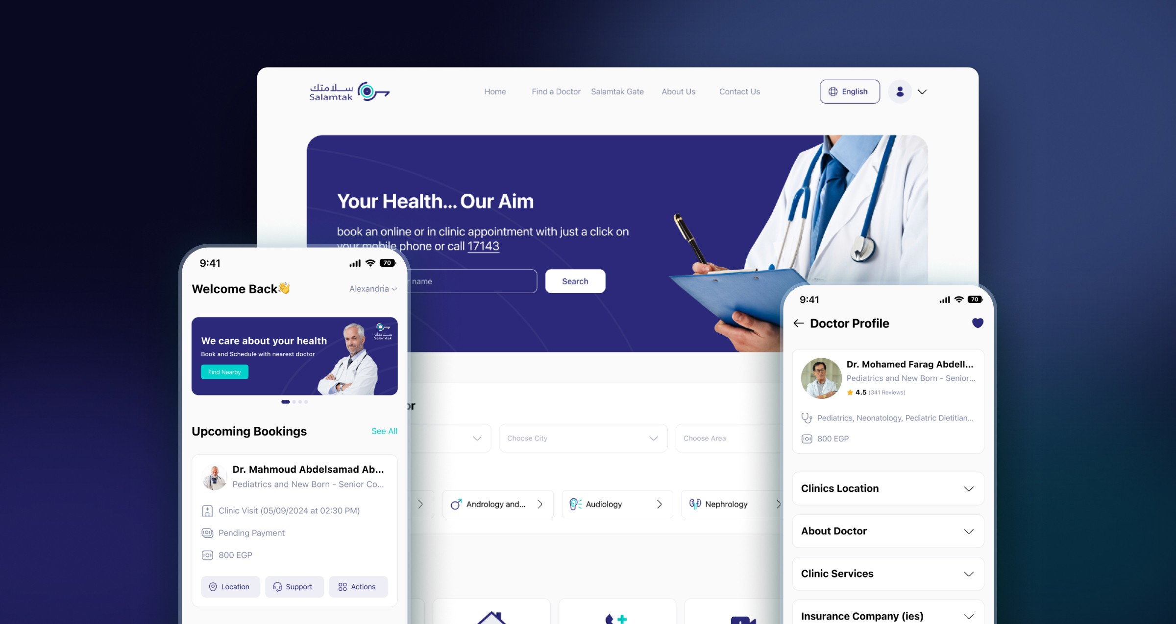
The doctor website reuses the app’s flows and components and uses the extra width for overview. The dashboard puts a week calendar, today’s cases and case status on one screen, next to bookings by type. Appointments, clinics, patient accounts and questions follow the same patterns in wider layouts.

The Outcome
Together we designed 214 doctor app screens and 101 website pages and states that take a doctor from sign-up and verification to running several clinics, keeping patient records and answering patients, in one account. The doctor side uses the same colours and components as the patient side, so a booking looks the same to both.