Bank Rabena: One Mobile App for Money, Health, Work and Community
Designing a share-based fintech super-app: wallet, stock market, marketplace, insurance and an AI co-pilot.
Company
Bank Rabena
Role
Senior Product Designer
Expertise
Mobile UX/UI, Fintech Flows, Information Architecture, Interaction Design
Timeline
2023

Bank Rabena is a share-based fintech platform: people buy shares, then spend, sell, donate or invest them across a wallet, a marketplace, health insurance, a stock market for talent and data, and an AI co-pilot. I worked on the research with the UX team and designed the mobile app: the information architecture, flows and UI for 466 screens and states across 10 modules. The web version was designed by another designer.

The Challenge
Bank Rabena wanted ten products in one app, for three kinds of account (individuals, service providers and companies), with real money moving between them. The risk was obvious: an app that does everything usually feels like ten apps stitched together, and an app that moves money has to earn trust on every screen.
What the Research Said
Together with the UX team, I ran 15 interviews and surveys with individuals, healthcare providers and companies, plus affinity diagrams, card sorting, competitor and SWOT analysis. The same three needs kept coming back: fewer steps to buy and use shares, confidence that money moves safely, and a way to connect users with providers and with each other. Those three needs shaped every mobile decision.

The Structure: Shares Are the Currency
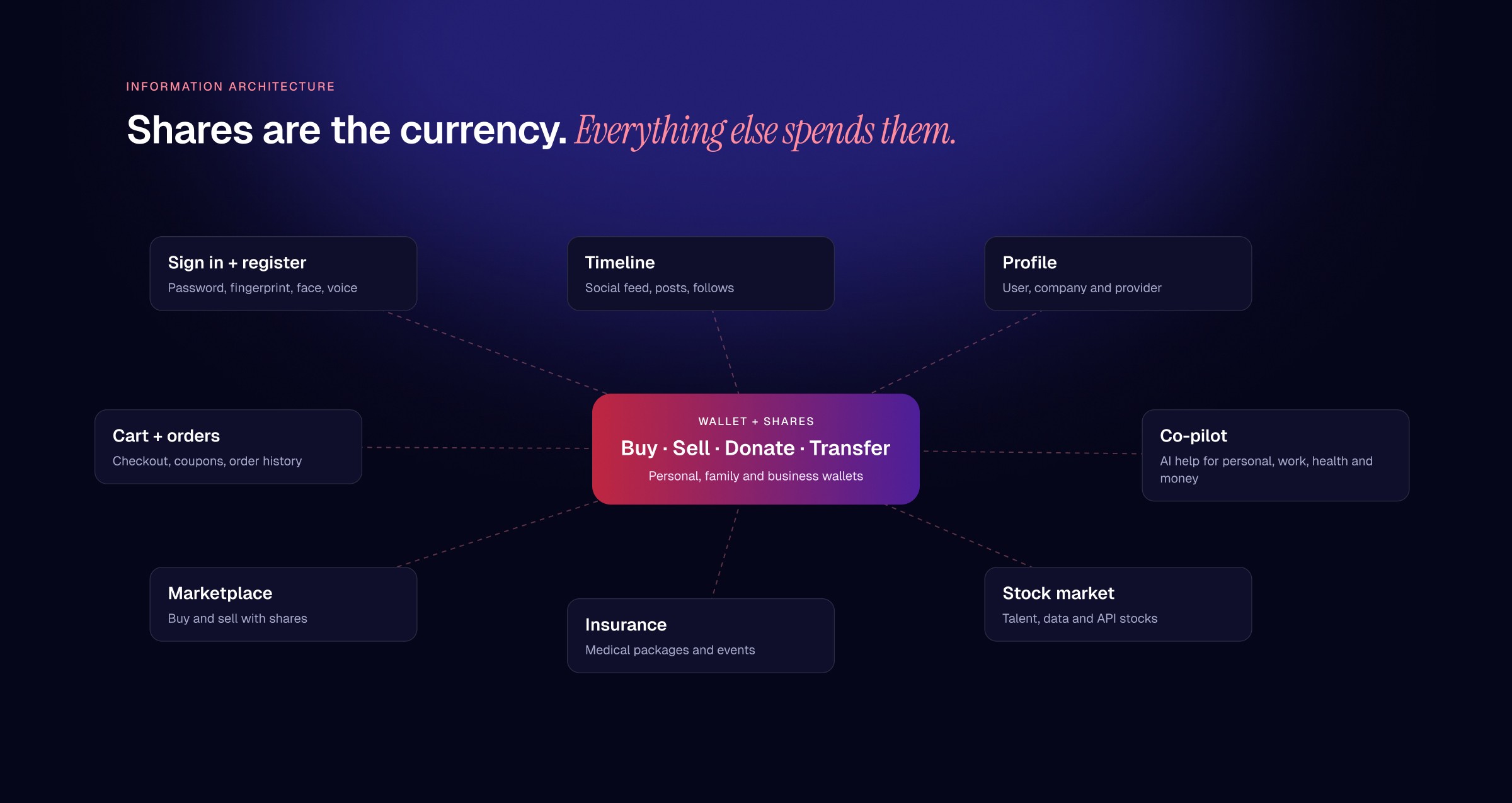
I built the information architecture around the wallet. Shares are bought, sold, donated and transferred there, and every other module (marketplace, insurance, stock market, cart and co-pilot) spends them. A timeline and profiles for users, companies and providers hold the social layer together.
Decision 01: Make the Most Sensitive Door the Easiest to Open
Sign-in offers password, fingerprint, face and voice from one screen, plus Google, Apple and Facebook. Each biometric has not-set-up, active and error states, and sign-up, password reset and two-factor sign-in all use email or mobile codes with clear wrong-code states.

Decision 02: Buying a Share Should Feel as Simple as Paying
The wallet leads with the balance, then the actions. Buy, sell, transfer, deposit, Bait Elmal, investment and loans all follow the same three steps: enter the amount, confirm with a biometric, see the result. Personal and business wallets sit behind one switch, with admin and accountant roles for companies.

Decision 03: Turn Skills and Data Into Something People Can Trade
The stock market groups talent stock, data stock and API behind one entry. Companies post challenges, talents solve them with files or an AI-drafted starting point, and jobs, proposals, contracts and data sets reuse the same cards, filters and detail pages.

Decision 04: An AI Co-Pilot Organised by Life Area
The co-pilot splits help into personal, work, health, financial and customer service, each with its own history and suggestions. Past requests are listed by date so people can repeat or refine them, and suggestions can become tasks with a date, time and repeat.

Decision 05: Spend Shares Like Money, Anywhere in the App
Every product in the marketplace is priced in shares, so the wallet balance always means something. Clients browse, filter and buy; providers create a store, add products and track sales; and one order history covers Bank Rabena and partner stores, with coupons and clear checkout errors.

The System: One Pattern for Every Money Move
A navy and white interface in Poppins keeps ten modules feeling like one product. The biometric confirmation sheet, success state, balance card, post card and product card are reused everywhere, so a pattern learned in the wallet works in the marketplace and the stock market too.

The Outcome
I delivered the full mobile app: 466 screens and states across sign-in, wallet, stock market, co-pilot, marketplace, cart, insurance, timeline and profiles, for individual, company and provider accounts, all built on shared patterns.