Salamtak for Patients: Calm Care When It Matters Most
Designing for vulnerability: Reducing friction when users are most anxious.
Company
El-Korashy
Role
Senior Product Designer
Expertise
Product Strategy, IA, UX/UI, UX Writing
Timeline
2022 · 2025

Salamtak is a healthcare platform for patients in Egypt: find a doctor, book a clinic, home or video visit, order labs and scans, book home care, and keep a digital medical record, on a mobile app and a website. I designed the patient experience with one other designer, sharing the whole product equally. We designed the first version in 2022 and a full redesign in 2025.

The Problem: Care Was Scattered
Getting care meant too many calls and a bag of paper. There was no single place to compare doctors, fees and distance; booking happened by phone with no clear slots; labs and scans were booked one call at a time; and prescriptions, results and invoices lived on paper. On top of that, people open a health app when they are worried, in pain or in a hurry, so every extra step costs more than in any other product.

The Goal: One Calm Place for Every Step
We set out to bring search, booking, tests, home care, records and questions into one account, on the phone and on the web, without making a worried person think. That meant managing a lot of complexity: 8 types of care provider, 4 ways to see a doctor, and more than 300 app screens and web pages.
Decision 01: Split Urgent Tasks From Browsing
Instead of a flat list of features, the home screen has two modes. Services and the Salamtak Guide (hospitals, pharmacies, labs and radiology) use bold, high-contrast cards that are easy to spot under stress. The Salamtak Gate keeps articles, quizzes and offers in a calmer layout further down. Returning patients see their next booking at the top, with location, support and actions one tap away.

Decision 02: One Booking Flow, Four Ways to See a Doctor
Clinic visit, home visit, video call or phone call is the first choice, not a hidden option. Patients then filter by specialty, seniority, insurance company, city and area, so the list only shows doctors they can actually use. A calendar shows available days, the summary shows the fee, and the confirmation says exactly what happens next.

Decision 03: Bring Labs, Scans and Nurses to the Patient
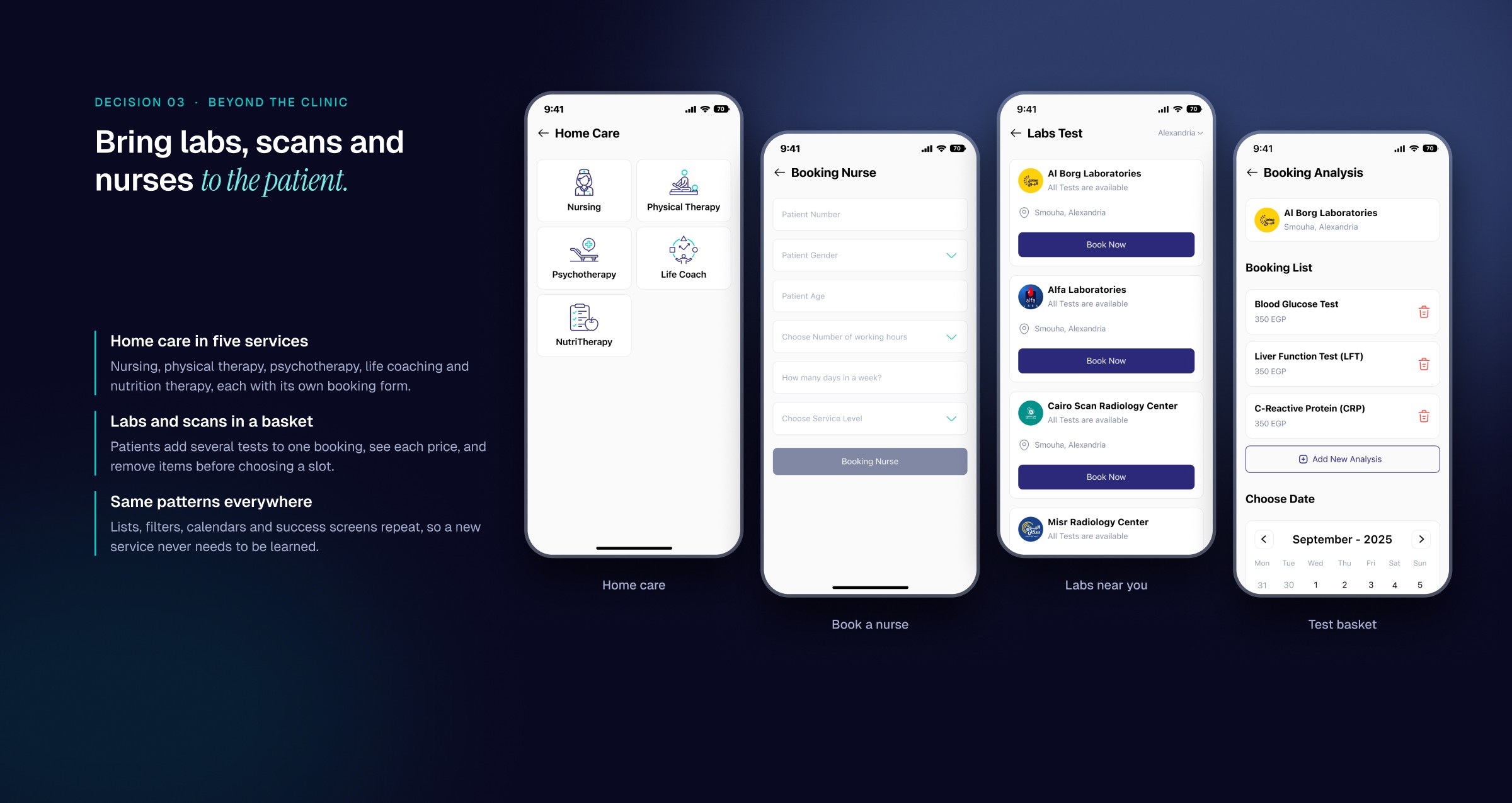
Home care covers nursing, physical therapy, psychotherapy, life coaching and nutrition therapy, each with its own short booking form. Labs and radiology work like a basket: patients add several tests, see each price, remove what they do not need and pick one slot. Lists, filters, calendars and success screens repeat across every service, so nothing new has to be learned.
Decision 04: Replace the Paper Folder
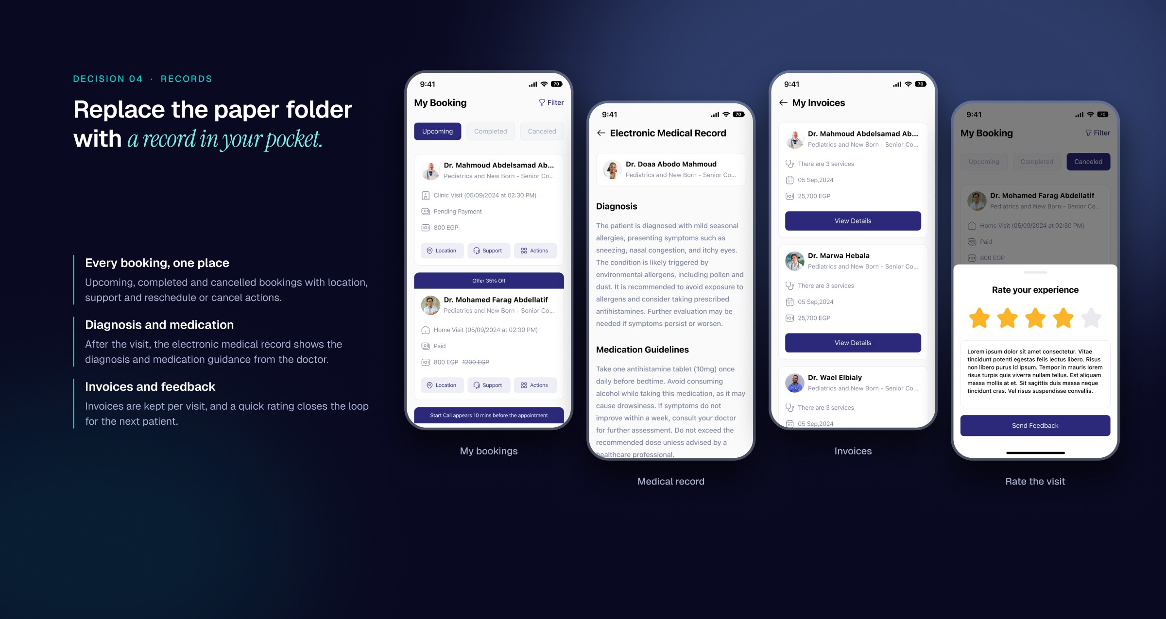
Upcoming, completed and cancelled bookings live in one place with reschedule and cancel actions. After a visit, the electronic medical record shows the diagnosis and medication guidance, invoices are kept per visit, and a quick rating closes the loop for the next patient.
Decision 05: Answer Small Worries Before They Become Visits
Salamtak Ask lets patients post a question by specialty, with age and gender for context, and get answers from doctors whose profiles are one tap away. The Gate adds short articles and True or False health myths, giving patients a reason to open the app between visits.

The Website: Same Care, Built for a Bigger Screen
The patient website reuses the app's flows and components and uses the extra width: a search-first hero, a doctor profile with the booking panel always in view, and bookings shown as a table with the medical record in a modal.

The System
Indigo and blue for trust, teal for progress and success, SF Pro for familiar, readable text, and large touch targets for people who may be unwell. Doctor cards, booking summaries, calendars, filters and success states are shared between the app and the website.

The Outcome
Together we designed 213 patient app screens and 122 website pages and states that take a patient from finding a doctor to holding their medical record, in one account. The 2025 redesign kept what worked in the first version and rebuilt the structure around the two modes and the single booking flow.


