Eats & Beats: One App for Every Way People Eat Out
Designing one dine-out app for reserving a table, pick-up, ordering at the table and splitting the bill.
Company
Eats & Beats
Role
Senior Product Designer
Expertise
Product Strategy, Information Architecture, Mobile UX/UI, Design Systems, Motion
Timeline
2025
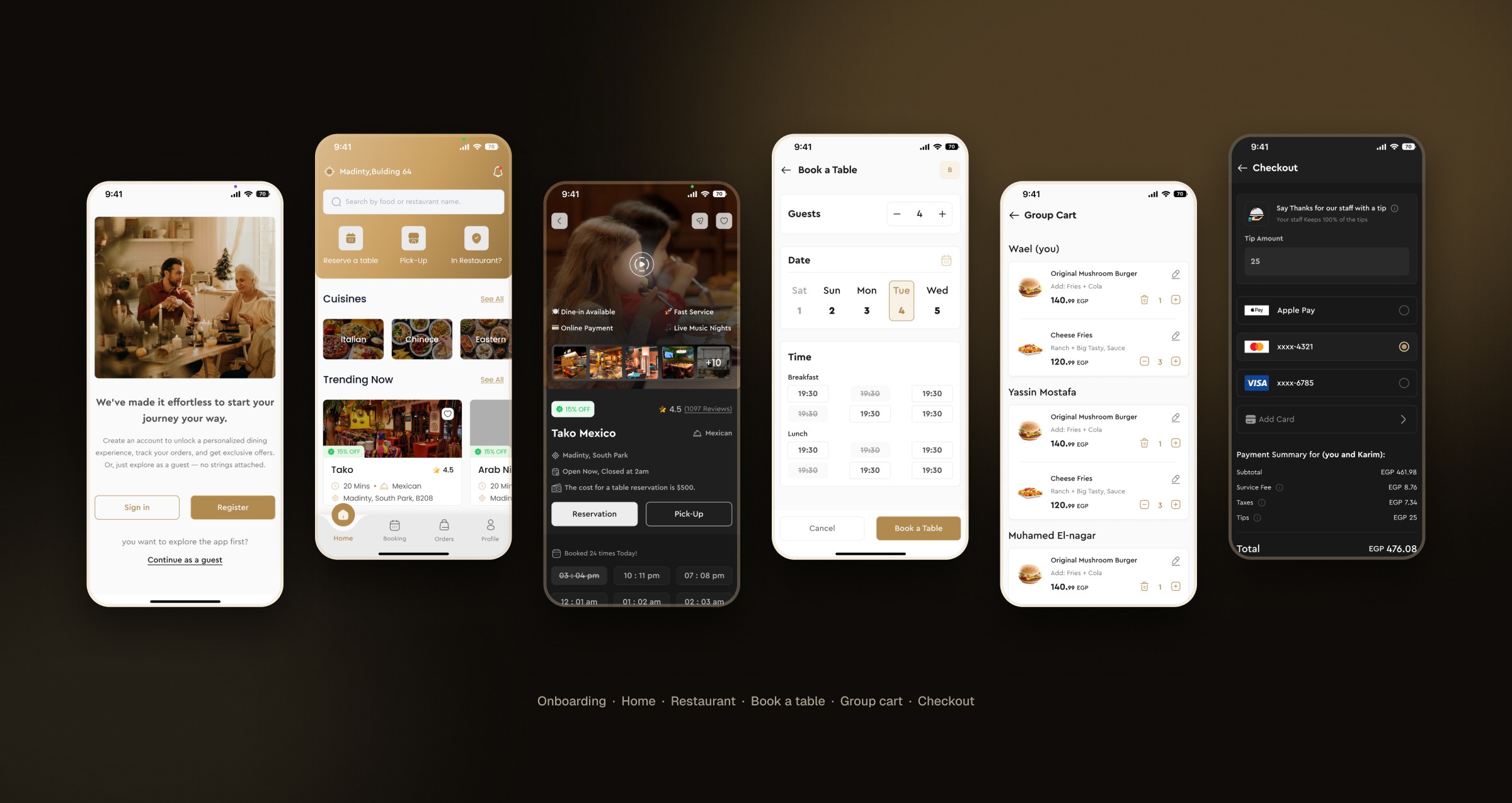
Eats & Beats is a dine-out app for Egypt. One product handles the four ways people eat out: reserving a table, ordering ahead for pick-up, ordering from the table and sharing a group order. I was the sole product designer and designed it end to end, from structure and flows to the interface in light and dark mode, the design system and the marketing site. The app shipped for the client.

The Challenge: Four Ways to Eat Out, One App That Feels Like One
Each way of eating out has its own timing, details and moment of payment. A booking needs time slots, rules and a fee; pick-up needs a menu, a cart and an order status; ordering at the table starts with knowing which table; and a group order needs a shared cart and a fair way to split the bill. They also share almost everything else: restaurants, menus, carts and checkout. The task was to keep one mental model across all four.

Decision 01: Ask How People Want to Eat Before Where
Home puts Reserve a table, Pick-Up and In Restaurant directly under search, so the first choice is the kind of outing, and every later screen only asks for what that mode needs. Cuisines, Trending Now, Near You and Exclusive Deals sit below for people still deciding, and a short App Guide points out each entry on first use.

Decision 02: The Whole Booking on One Screen
Guests, date and time sit on one screen, with slots grouped by meal and unavailable times struck through. Booking rules are agreed before payment, a summary lists every detail and the fee, and the confirmation leads straight to directions or the booking. I also designed a step-by-step version with a visual floor plan, kept for a later release because it needs each restaurant’s layout mapped first.
Decision 03: One Restaurant Page, Two Ways to Commit
Reservation and Pick-Up sit side by side as equal actions. The next open time slots and the reservation cost are visible before the tap, and rating, reviews, opening hours, menu highlights and location are in one scroll, with Book a Table always in reach.

Decision 04: Same Menu and Cart, a Different Start
Ordering at the table starts by entering the table number or scanning its QR code. After that, the menu, item options and cart work the same way as in pick-up, with notes, a voucher field and a full payment summary. A pick-up order ends on an order status screen with the route to the restaurant.

Decision 05: One Cart for the Table, a Fair Way to Pay
Friends join a group order from a shared link and add their own dishes, and the group cart shows who ordered what. At checkout the table chooses to pay for everyone, let everyone pay for themselves or customise the split, and each person sees the share they are paying, tip included.

Decision 06: Give People a Reason to Come Back
Rewards shows the points balance with a history of points earned and spent, offers grouped by dining and pick-up, and vouchers split into active, used and expired, each with its own details.

Designed Twice: Light and Dark
Both themes use the same layouts and components: 155 screens in light mode and 133 in dark mode. Gold stays the action colour in both, on cream and on near-black surfaces.

The Marketing Site
The landing page states the product in one line, explains the benefit of each mode, shows real app screens in a See It in Action section, and ends with store links and a partner form for restaurants.

The System
Poppins and Cera Pro carry the interface. Gold marks actions and selected states, sand and cream add warmth, and one component library, from restaurant cards to the bottom navigation, is themed for light and dark.

The Outcome
One app covering the whole dine-out journey, from onboarding to rewards: 288 screens across light and dark mode, a design system and a marketing site. Next, I would ship the floor-plan picker and measure how people use each of the four modes, so the next design round starts from real usage.